Working with images
You can drop images, diagrams, or illustrations anywhere in your content. Images are automatically set to 100% width and centered with a subtle shadow and some small padding. There are two primary methods for adding images to your pages, each with its own set of pros and cons:
Standard images
If you have used Markdown before, this will be the familiar and typical way of adding images:
- Add your image to the /content/images folder – drop any image into your /content/images folder and you will be able to reference it from any of your markdown pages
- Reference the image in your page – once you’ve added your image you can reference it from anywhere using the following syntax:


File size
Using this technique, the page will load your image exactly as your exported it, which means you are responsible for file size and dimensions. If you upload a 20MB file, the width of your image will be restricted to 100% of the main column width, but you will sending the entire 20MB. (This is a bad idea! )
Other notes
- Each image is linked to a full-sized version of the image that will open in new tab
- This is useful for sharing large diagrams or other images that may benefit from full screen viewing
- Your images will not have an explicit height or width, which produces a warning (but no performance hit) in Google Lighthouse performance scores.
Did you know? You are responsible for your image sizing and optimization, and should upload the smallest useful version of your image. Use your image editor or any number of online tools to size and compress your images before uploading!
External images
You can also refer to any external image via URL including sized Unsplashed images, transformed images from Cloudinary, or anywhere you can source an image online:

Image captions
Images are centered by default, and there is a special syntax to add a caption directly below your image with centered text.The matching arrows will center your caption, and the underscores will italicize the caption.:
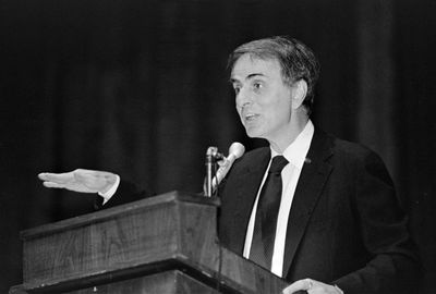
->_Carl Sagan, 1987_<-
Responsive images
You can also take advantage of the Eleventy Image plugin to generate and serve fully responsive images. This is a great option for image-heavy sites, or anybody who wants to serve smaller, next generation image files.
- Add your image to the /content/images folder – these images go into the same folder as any other image
- Reference the image using a custom shortcode – once you’ve added your image you can reference it from anywhere using the following syntax:
This syntax will generate 8 different sizes of your image, in 3 different formats (webp, jpeg, png) resulting in 24 different versions. The browser will automatically serve the best and smallest version of the image based on the users current screen resolution and browser support.
Custom sizing
You can also specify a custom size in pixels to force a smaller version of your image. The browser will chose the closet match, and then size to your specifications.
Limitations:
- There is currently no way to add a link to one of these responsive images, due to limitations in Markdown
- There is no GIF support
- There is no support for external images (e.g. Unsplashed or Cloudinary)
Did you know? If you host a lot of images, you may want to reduce the number of variants that are generated to speed up your build times. This can be adjusted in your .eleventy.js configuration file. Spacebook currently generates 8 different sizes to accomodate most scenarios, but this could be adjusted to generate only 3-4 images if necessary.